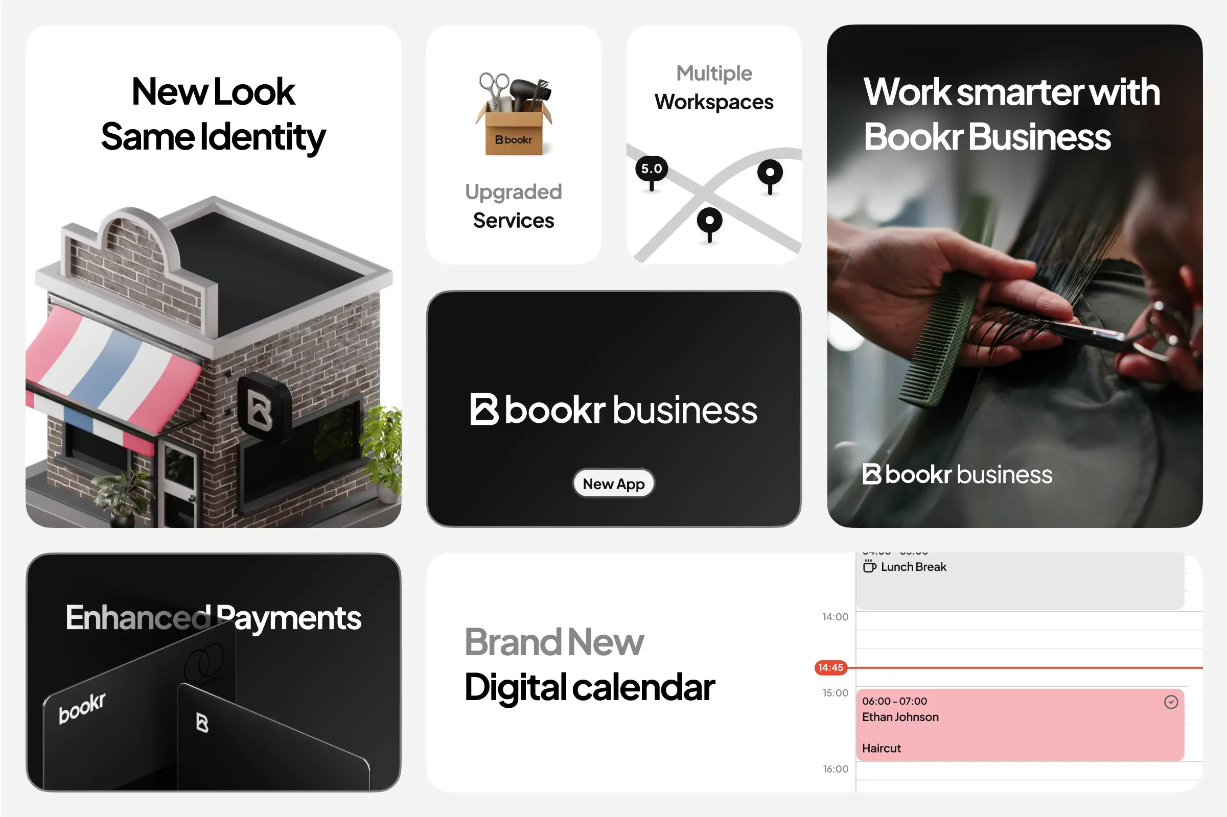
Bookr Business
I led product design for Bookr Business with a single mandate: evolve a monolithic platform into a scalable ecosystem. That meant decoupling the business experience from the consumer app and establishing a unified, portable design system that could ship consistently across web, iOS, and Android. My scope covered product strategy, the end‑to‑end design system, interface design, and accessibility, with a constant focus on visual and behavioral continuity between platforms. Historically, one app attempted to serve both audiences, which produced load issues and operational complexity. Visually, the language looked similar across web and mobile, yet each platform ran on a different component library. Any new feature had to be built two or three times.
The goal was to separate products cleanly and replace parallel design systems with one shared foundation, so teams could ship faster with fewer defects and a clearer mental model.
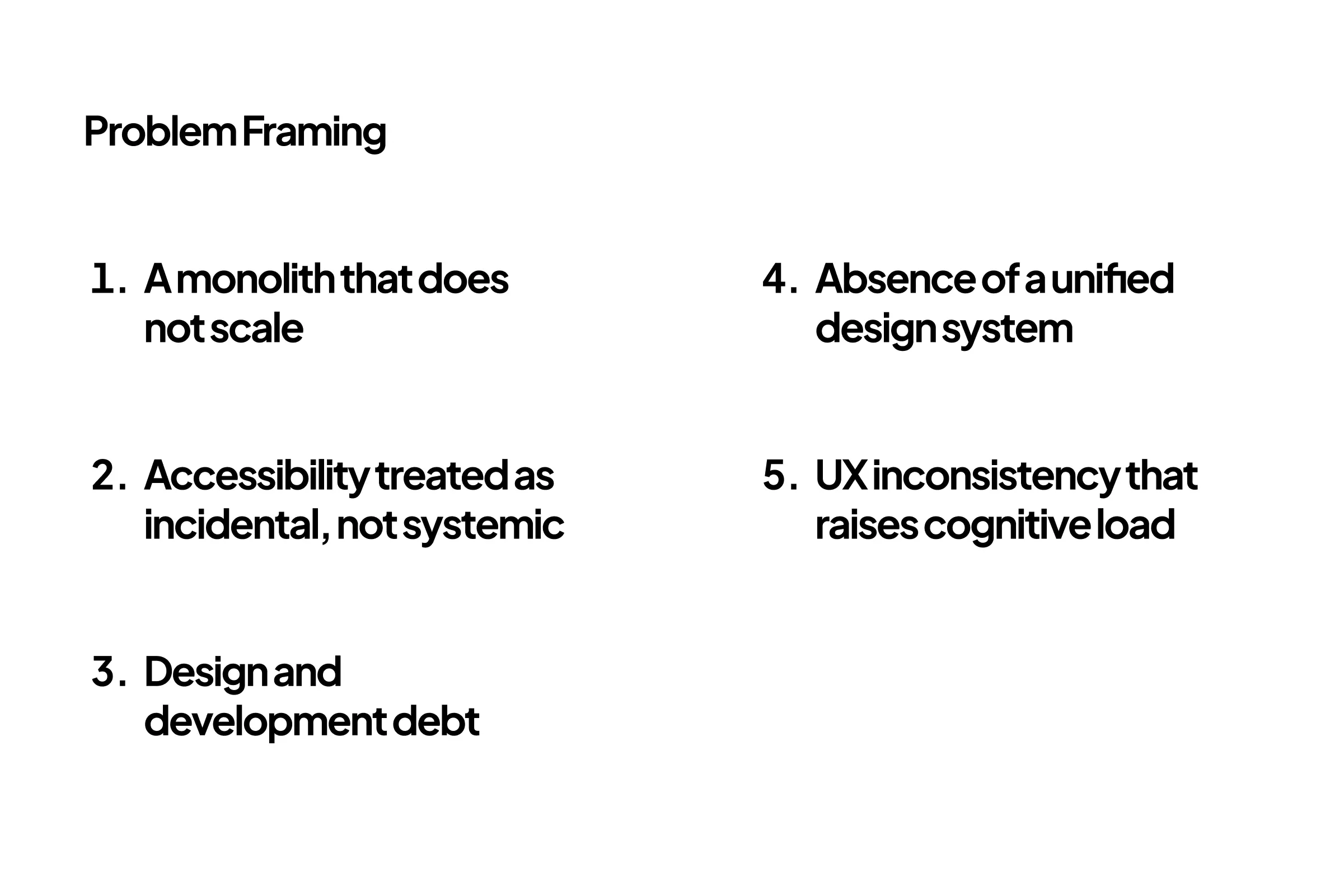
Problem Framing
The legacy model strained under growth. Scalability and performance suffered as the single app handled unrelated business and consumer concerns. Design and development debt accumulated because each platform owned its own component set and patterns, creating duplication and drift. Users felt the inconsistency: flows that looked familiar behaved differently on each surface, raising cognitive load and QA cost. Accessibility was incidental rather than systemic, so contrast, focus, and motion guidelines varied by implementation. The central challenge became how to create one design system that encodes the same component decisions and interaction rules, then expresses them on web and mobile without losing clarity or quality.
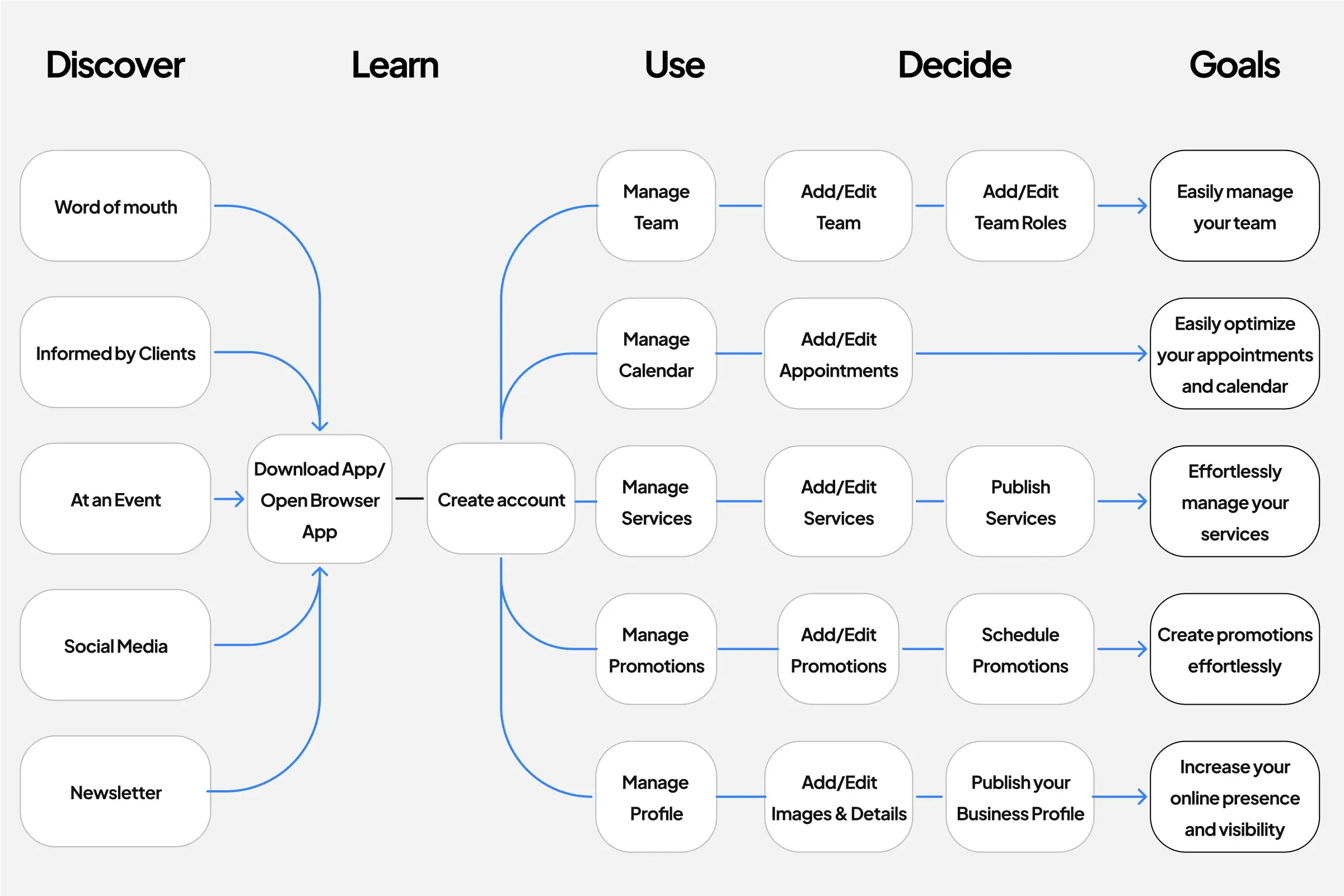
Discovery & Explorations
I mapped the end-to-end journey as discover → learn → use → decide → goal: awareness channels lead people to open the app, a brief orientation builds confidence, core tools cover team, calendar, services, promotions, and profile, and explicit publish moments turn usage into progress tied to clear outcomes.
In parallel, I separated the business domain from consumer needs and defined what is shared across products versus what remains specific to the Business app.
Layout work established responsive grids and predictable breakpoints so information density scales from desktop dashboards to handheld views.
Component exploration began with cross-platform primitives (buttons, inputs, selects, sheets, modals) and matured into macro flows such as Calendar, Booking, Service Builder, Payments, and Staff or Workspace selection.
Throughout, I evaluated flows against usability heuristics and WCAG guidance, refined microcopy for high-stakes actions, and standardized empty, loading, success, and error states. The aim was simple: reduce cognitive load, make intent obvious, and keep failure modes recoverable.
Unified Design System
The design system is built as a layered model. At the core, tokens encode semantics: color palettes with sufficient contrast in light and dark, a responsive type scale that preserves hierarchy at any size, spacing and radius rules that produce consistent rhythm, and motion curves and durations that communicate state without distraction.
Where it clarified meaning, we introduced a 3D illustrations library to define key actions and feature states, adding depth and affordance without increasing cognitive load or hurting performance. A single cross‑platform icon set anchors semantics and accessibility across web, iOS, and Android, so the same symbols read the same everywhere.

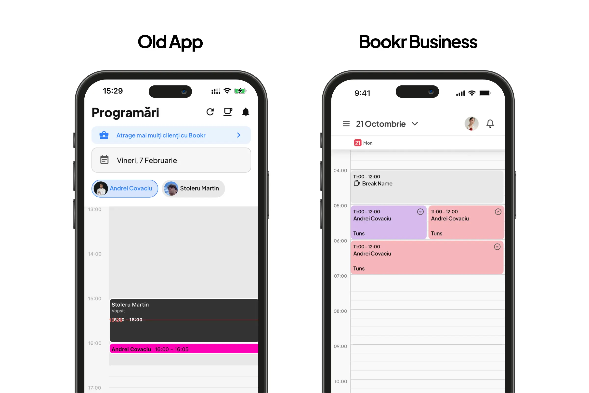
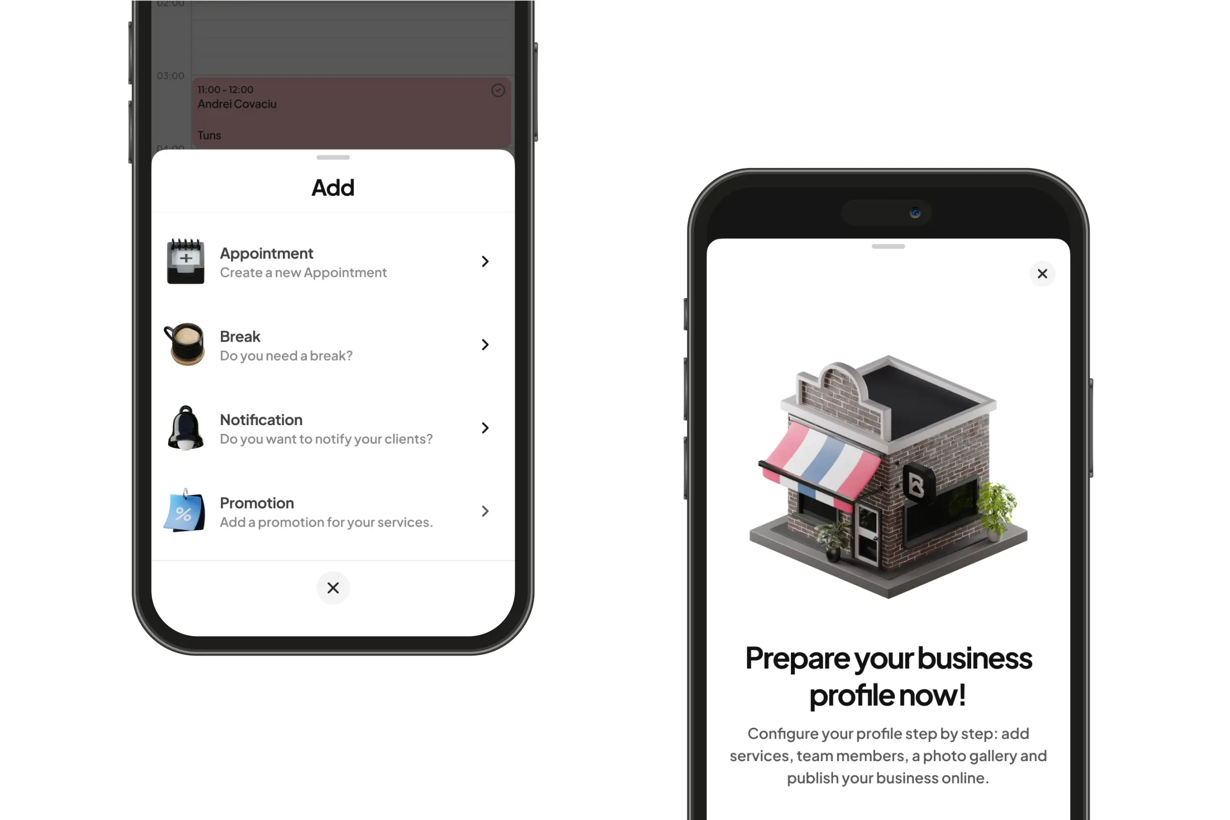
Bookr Business Mobile App
The new Business app focuses on daily operations: bookings, team, services, and payments. The visual language received a considered facelift, clearer hierarchy, tighter density on small screens, consistent gestures, and an optional dark theme for low‑light environments. Under the surface, we simplified how the system thinks about time, capacity, and entitlement. Subscriptions became scalable; businesses can allocate sessions over time instead of scheduling everything at once.
Workspaces support multiple locations with a unified calendar view or per‑space filtering and role‑based permissions. Services support add‑ons, duration variants, and dynamic pricing so businesses can represent reality without hacks. The calendar offers day and week views, drag‑and‑drop rescheduling, time blocks, and explicit conflict signals. Group bookings synchronize slots and capacity across attendees. A payments dashboard surfaces transaction status, reconciliation cues, and payout forecasting so owners can understand cash flow without leaving the app.
Design Decisions
We set out to make the product read and behave the same in every corner of the app. The core move was a universal List component that covers the majority of data views, from user directories and staff rosters to booking summaries and appointment metadata. The List accepts shared tokens for density, states, and affordances, and composes predictable cells, avatars, tags, and inline actions. Paired with a preconfigured Action Sheet that slides up from the bottom for create, edit, reschedule, we eliminated bespoke UI for routine actions. This reduced surface area, made the app feel coherent, and cut the cost of adding new flows.
Conclusion
Bookr Business is still under active development. To date, the unified design system and the new Business app have been specified, prototyped, and integrated into our working libraries, which has already lowered parallel effort and increased consistency across platforms. While the product is not yet live, early internal builds show the intended shape of the experience: flexible subscriptions, group bookings, a clearer calendar and a transparent payments view. The most durable outcome so far is not any single screen but the shared way of solving problems. With one language for components and patterns, teams align faster, change is less costly, and we are on track to deliver a calmer, more intelligible product once released.
